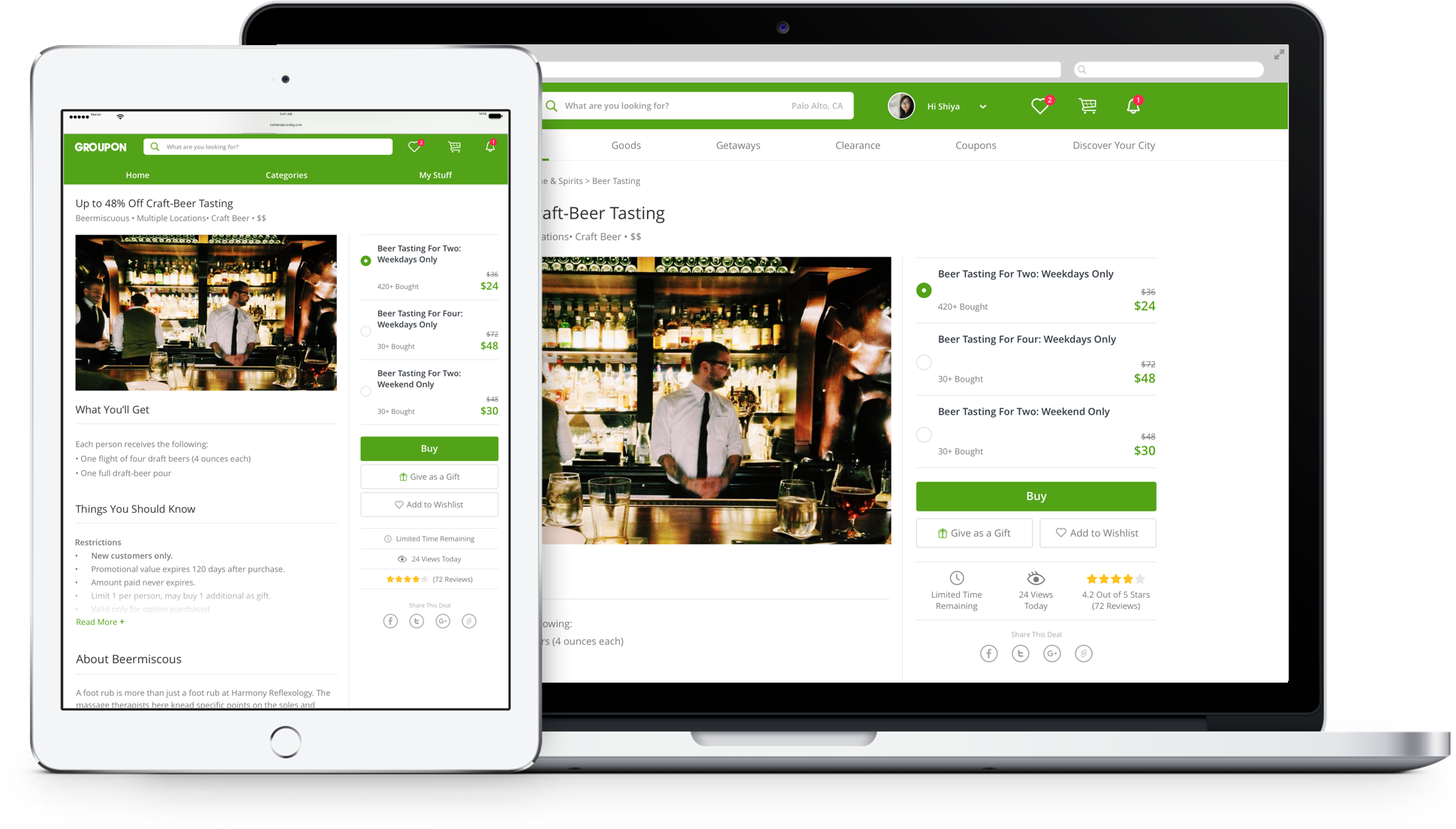


Desktop deal page is where Groupon business started. Back in the days when Groupon only sell one deal a day, all a user has to see was the deal page. However, Groupon has changed so much that a simple deal details page design no longer meet the needs of our multi-business.
We tried more than a dozen of optimizations on the page in the past year and a half, but we never got to make significant changes on deal details page on desktop, due to the unique setup of our organization and operational changes in the company.
However, in Q2 2016, following the success of mobile web 2016, we decided to bring the thinking and learning to the desktop platform, finally my design saw the light of day.

A couple of researches was done on desktop and mobile deal details page, in order to understand the user behavior and pain points on the current deal details page design. Base on the research results, I focused my effort in the most important information highlighted in the Max-Diff survey research, deal options, to start with.

In the wireframe explorations, I focused my effort designing the most important part of the page at the top, because it sets the baseline of the entire page structure. After reviewing these 4 major frameworks with the team, I quickly eliminate the horizontal layouts because of scalability issue for different offerings.
1. Image and option selection should be close to each other.
Most of Goods product has multiple color and shape selections, user should be able to quickly see the updates of images of the product.
2. Options area should be scaleable to accommodate multiple options.
Around 20% - 30% of the deals in Groupon has more than 4 options, in some extreme cases, there are might be 20+ options on the deal details page.
Based on the research findings and the explorations, I came up with this design statement that guided me through the complexity of the design process.
" Build a design framework which efficiently use the screen real estate on desktop, highlight the important information about the deal, and scales across different offerings. "
Here's the design we are moving forward with in Q3 2016.
There are more than 20 different types of offerings within Groupon, and a user shouldn't have to understand the complex structure of our organization to enjoy the shopping experience on Groupon. To simplified the design framework, I categorized these deal types into a few buckets, which has sharing design components.

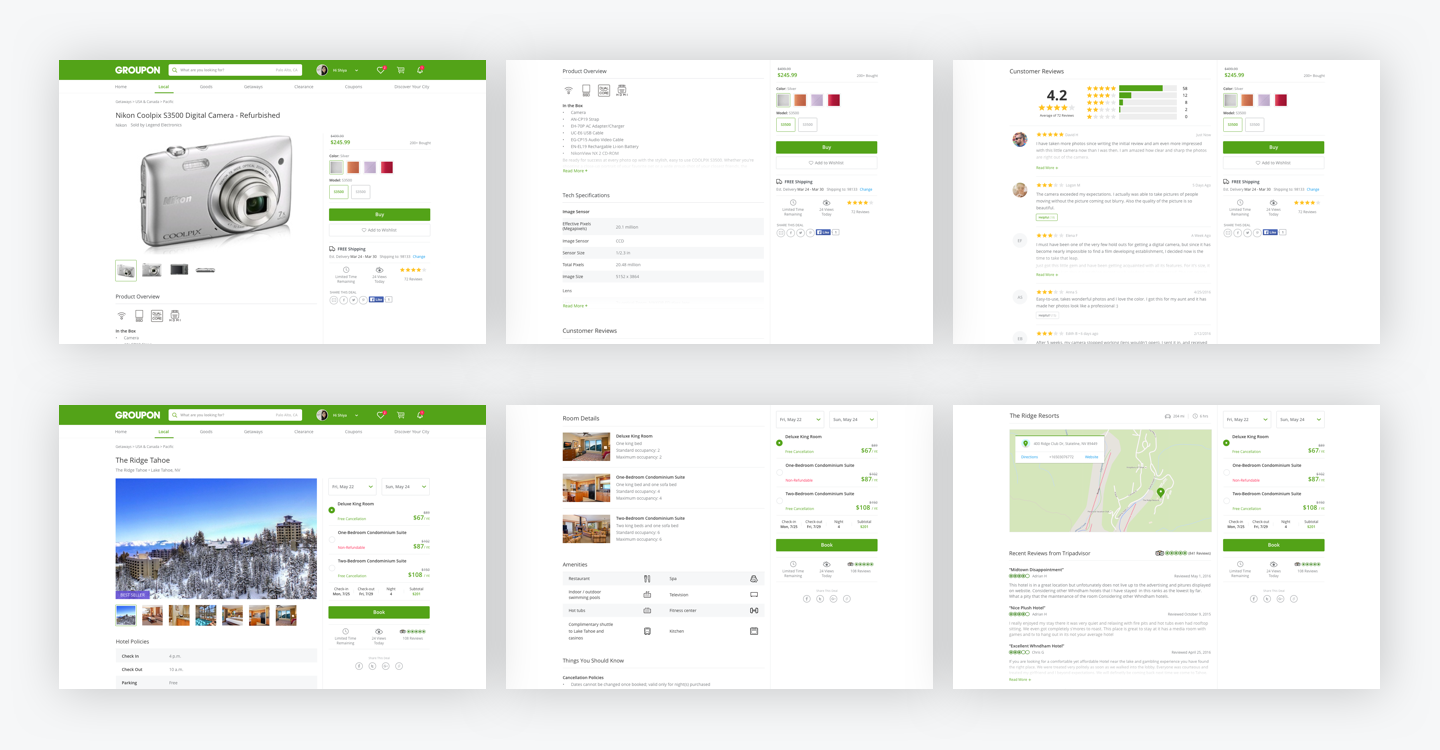
Even though Groupon focuses mainly on the local business sector, from a design system stand point, we still want to keep the consistency between different offerings, so that a user can always find what they are looking for. Here are some of the key screens of the other major frameworks.
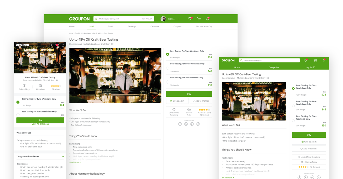
The deal details page redesign project started as a responsive initiative, but timeline was pushed off till early 2017. As a mobile first company, our redesign effort started with mobile screens and then scale to tablet and desktop.
To better understand the browser behavior and the page reaction, I coded a responsive prototype with HTML+CSS. The main purpose of the prototype was to communicate the movement of design elements on the page to product manager and developers, so that the team can provide feedback on a something other than a static mockup.
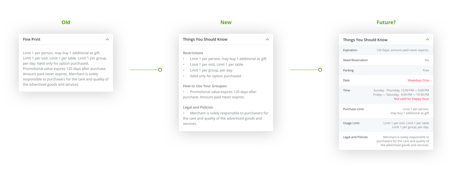
One of the most challenging feature I've worked on during the process was redesigning the Fine Print section.
Fine Print is where users understand how to use the deal, and find out about any restrictions that are applied to the deal. For example "Limit 1 per person", and "Not valid for happy hour".
In the researches, we found that a lot of users had negative experience using Groupon because they did not pay attention to the restrictions in the Fine Print section. And majority of these users ended up not using the Groupon, and never came back to buy Groupon again.
Business analyst shows that, negative experience due to not noticing fine print lead to increase of customer service contact, increase of refunds, and reduction in future transaction. We estimate a 5 million dollar lost per month with the Fine Print issue persist.
We ended up A/B testing the design in the middle of the image above. And the team had to be really careful about what success metrics we evaluate against, because making restrictions about the deal more clear to users doesn't not necessary help conversion lift. We will also track customer service calls and refund for this design.
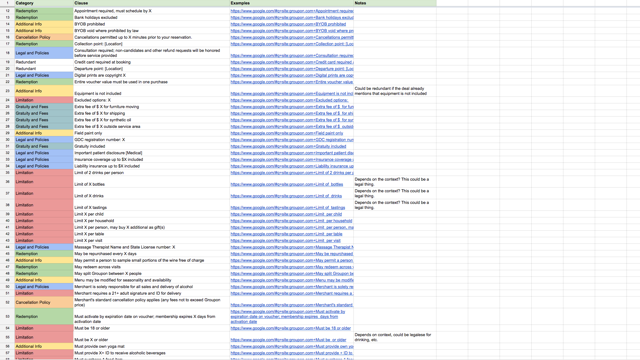
1. Gathering Info
To tackle the Fine Print problem, I connected with multiple stakeholders in the company to understand how we setup a deal, and collected a list of 120+ unique fine print clauses.
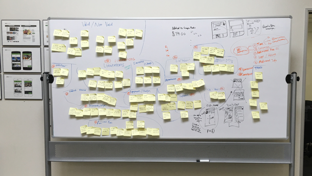
2. Affinity Diagram
By grouping different fine print clauses into different categories, I could see a few major buckets that they fall into. The categories that I found are, Redemption, Restrictions, Cancellation Policies, Gratuity and Fees, Legal Policies, and Everything Else.
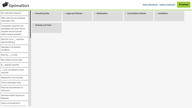
3. Card Sort Research
To validate our categorization, we recruited Groupon users to do a similar exercise using a online card sort tool. We also asked users to rank by importance, and ask suggestions for category names.
Desktop deal details page redesign is still a ongoing effort, we will release some of the new design in 2016. We are also planning to do evaluation research on the desktop design, to triangulate qualitative user research data with A/B testing quantitative data.
The deal page redesign effort has a high impact within the company, not just because of the business growth. Our work and process was inspiration for other teams too.
1. User Research
We are planning a eye-tracking user research on both mobile and desktop to better understand user focus on deal details page. Based on these research data, we are better prepared to next round of iteration.
2. Collaboration
The deal details page redesign effort touches multiple cross-functional teams within the organization, our collaboration inspired a new working model.
3. Impact
Merchant team started to look into new ways to help merchant set up deals by highlighting most important info that users care about.
Deal setup team and backend services started to work on structuring fine print clauses to that user can filter on deals using these data.