
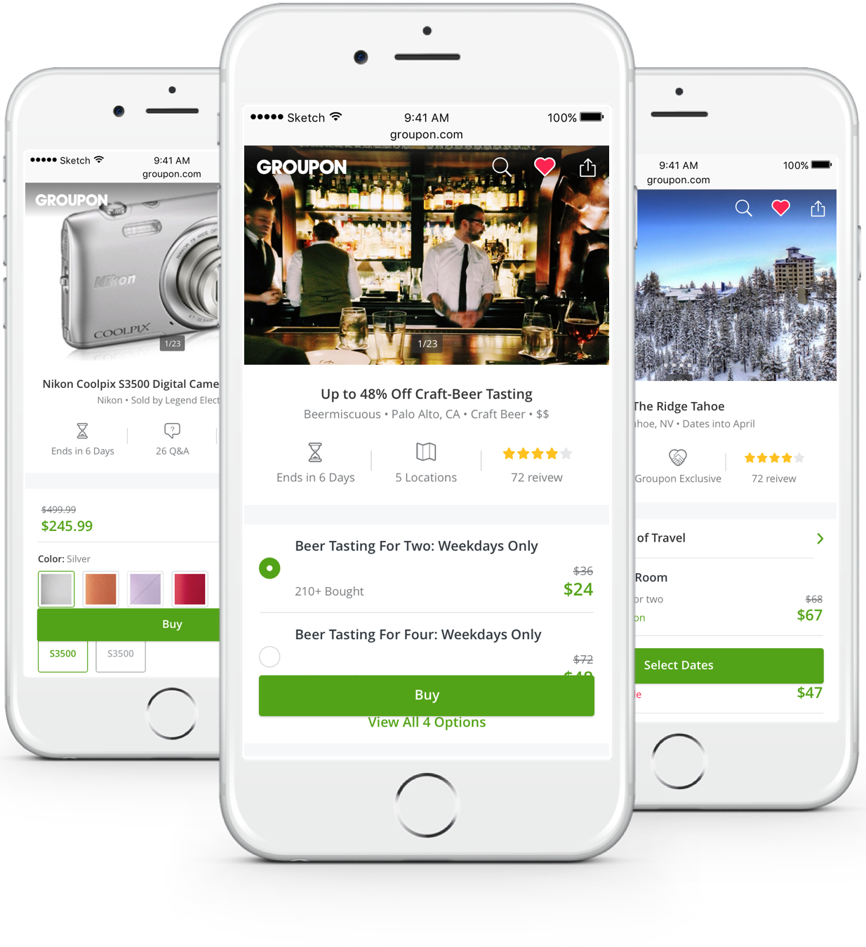


2016 is a year of change for Groupon. Project "M16" was initiated to redesign the out-dated touch platform. Deal details page as one of the most important steps, is in the heart of this redesign effort.

Everyday, Groupon has about 2 Million clicks on deal details page, and we sell an average of 10,000 deals. All of these deals we sell, they have one thing in common, every single one has to go through a deal page.
" Deal page is an important milestone in users’ journey with Groupon. This is where they gather information, answer questions, and make final purchase decision. "
It's crucial to understand current customer behavior on deal details page before we jump into design solutions.
With the support from a strong business partner and a knowledgeable researcher, 3 researches was conducted to identify user pain points on the deal details page for web and mobile.
1. Compelled Shopping
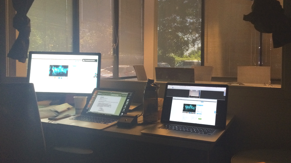
Compelled Shopping research was a lab study in which incentive was given to Groupon users to shop in different categories, including Food and Drink, Electronics, and Hotel Booking.
Key Findings
+ A trustworthy and reliable source of ratings and reviews is needed.
+ Business should be easily identified.
+ Authentic images of food, place, and product is necessary to build confidence in the purchase.
+ Important details should be highlighted and easy to find.
2. Competitive Analysis
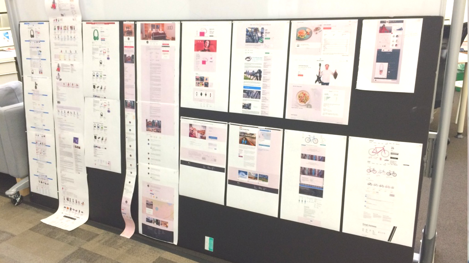
I conducted a competitive analysis to identify mobile web best practices for design patterns and interaction in the e-commerce world.
Key Findings
+ Mobile web navigation is different from native app because the unique browser environment that it's living in.
+ Back button is not needed since this functionality is replaced by browser navigation.
+ Product detail page should provide easy access to suggestions or other categories to prevent early drop off.
3. Max - Diff Survey
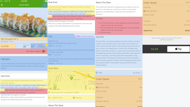
Max-Diff survey was conducted to determine the relative usefulness of the content on deal details page.
Key Findings
+ Price, options, and merchant information are the most useful element regardless of category.
+ Important information is scattered on the page, users have to scroll up and down to look for what they need.
+ Some key information is hidden a long paragraph, which is not optimized for easy digestion.
Early research and analysis revealed four key principles to guide us through complex design challenges.

Right For Me
Understand what I need and where I am, show me the right thing at the right time.

Show Me What Others Think
Help me understand what I need to know by showing what others say, don't make me go to another site to find out about it.

Highlight What’s Important to me
Show me what I need to know at the right time, and make it easy for me to find the details that I want to know.

Help Me Make Meaningful Connections
Help me create personal connection with the merchant, be truthful and authentic when presenting ourselves.
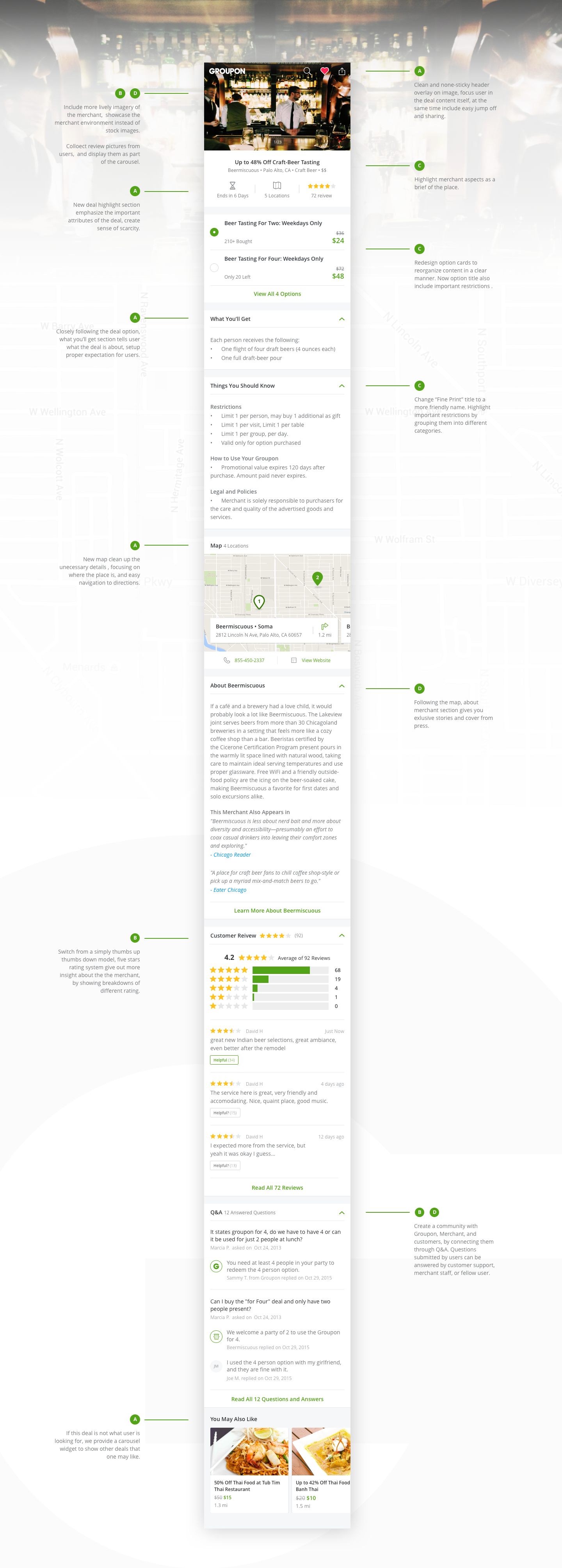
Here's close-up view of the new deal details page. The new deal details page presents information about the deal, the merchant to customers in a thoughtful, deliberate way. Highlighted by design principles, we tried to solve user pain points one by one.
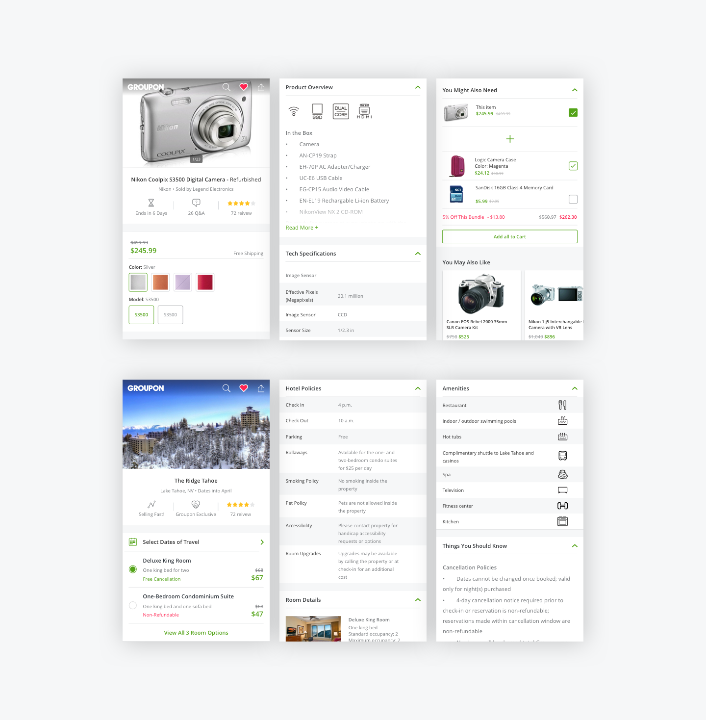
A big part of Groupon's business is also selling physical products and travel deals. Here are some key screens designed following the same design principles.
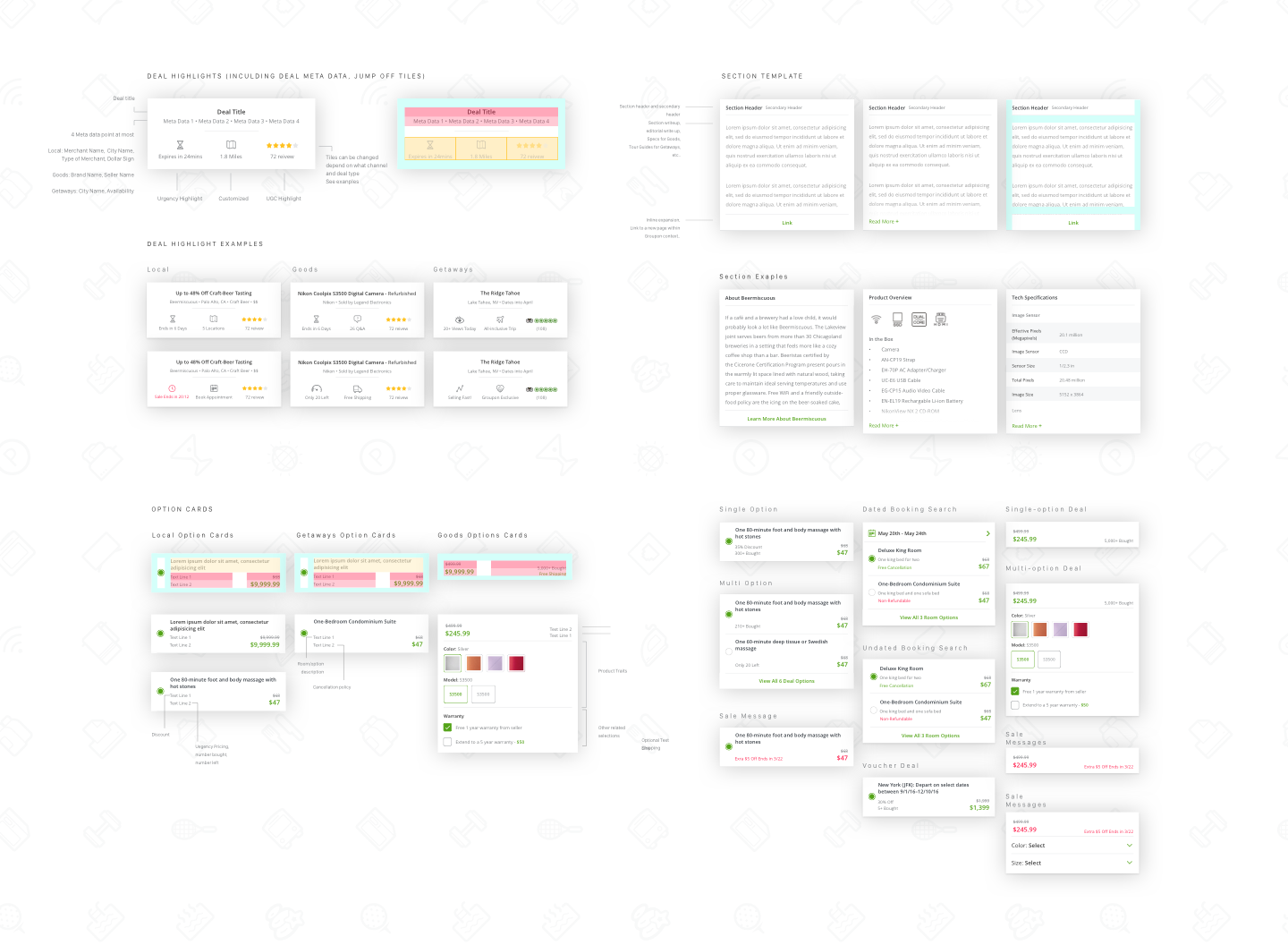
Even with different types of offerings that we have in Groupon, we still want users to have a similar experience through out. As a result, the deal page design system was introduce to establish consistent design patterns. It also benefits the implementation process where our developer team can always refer to the same documents and assets no matter which team they are in.
No matter how good a design is, it's not complete without evaluation and proper implementation. I wanted to get internal and external design feedback, these feedback allowed me iterate on the design and move forward with the final implementation. The outcome of these evaluations came out really positive.
1. Usability Testing
A usability testing was conducted to evaluate the key concepts of the design, focusing on deal highlights, option cards, and the overall new layout of the deal details page. Had really positive feedback from users participated in the research.
2. Presentations
Because deal details page touches a lot of different teams' work, to gain feedback and support, I presented this new design to more than 10 teams within the organization, including the CEO of the company.
3. A/B Testing
We launched the new design as an experiment on Jun 15th, comparing it against the old design. With less than a month, we concluded the new design as the winning variant. The new design generate a 2.05% in Net Operating Booking, which is momentous.