Website and smart phone application design, summer internship 2012.
4 Weeks. Intership, July, 2012
Bili Xia, Youmans Ye
UX Design, UI Design
Website Mockup, Design Specification
Nudesign is a HongKond design company with more than 20 years experience in product design and manufactuing. Nudesign has two main product lines, one is Recycled Leather, which dedicates to colorful recycled-leather-made office equipments. The other line is Lifesytle, which focuses on fun and happy small personal items.
During my internship in here, me and my teammates helped redesign company's website to meet their e-commerce need. We also created a new iphone application for their product showcase.

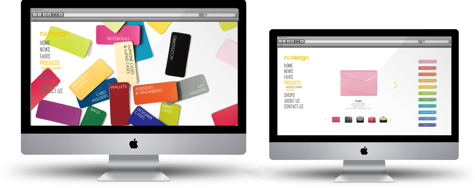
The website is primarily for business use: product showcase to clients, news update, and possible e-commerce transaction. So we tried to keep it simply and clean, yet stylish, because we want to show the fun and happy characteristic of the company.
Business Partners, Manufacturers, Distributors, Future Clients
Product Showcase, News Update, Company Profile

We also identified a few local competing companies by competitive analysis. We found that at that time, mid-2012, most of these companies' website didn't support e-commerce yet. There was a big oppurtunity for Nudesign to make to first move.

A sitemap also helped us to organize the flow of the website.

In the Recycled leather section, we focused on the leather material itself. We used company's colorful leather as catalog, each color of leather represents a different kind of product. In the product detail page, you can see all the available color for this one item.

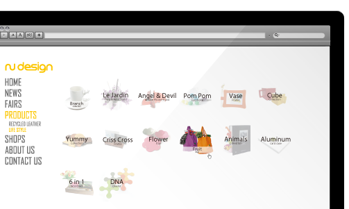
In the Lifestyle section, we tried to keep things in a ambiguous state, it reveals when users move their mouses to the product.
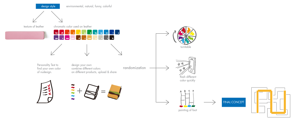
One thing that we really want to convey to our clients are the fun and interesting aspoect of Nudesign. We believe no matter who you are, there's always a product for you in Nudesing. We decieded to explore the idea of randomization to engage users.

We created a map for the Nudesign journey. Products are displayed by the yellow route of Nudesign's logo. And then the branch roads are added randomly. By sliding to different directions on the interface, the app would show the map's content according to the branch road.
Our application is in hand drawing style, and our logo follows the same style. We choosed to do this because we want to show the casual and fun personality of the company. As you can see below, each product has its own little story.

This is what you see on the phone screen, every product has its own animation, when it stops, the arrows appears, then you can continue your journet by sliding to different directions. The slide route is based on the map on the right.

Every page has its own animation to convey nu's lifestyle. Here is one example of branch cup. The cup and the letter "BRANCH" is empty at first, and then the coffeepot comes and fills them together. In the end a cup of coffee is ready for you to taste.
Copyright © 2014 Shiya Liang. All Rights Reserved.